Seravek
A highly functional sans serif


About
Seravek, designed by Eric Olson, is a sans serif typeface published by the Process Type Foundry. It was made to meet to the demanding needs of information, editorial, and identity design, where the twin forces of richness and clarity must co-exist. Seravek strives for a clear functionality and near invisibility: its letters are unobtrusive, refined, and imbued with a sense of modernity.
Features
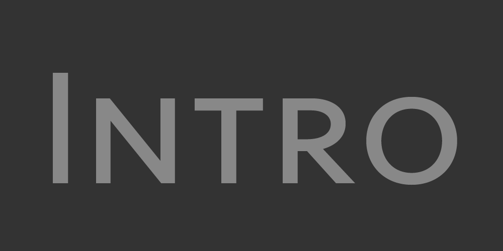
Small Caps
Seravek has Small Caps and OpenType All Small Caps. The design of the small caps has its own appeal, particularly the wider capital letters and looser spacing.
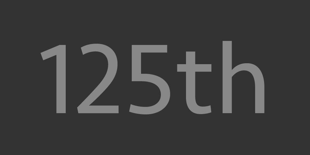
Numerals
For a wide range of communication needs, Seravek contains multiple numeral styles: Lining, Old Style, Small Caps and a Tabular version for each.
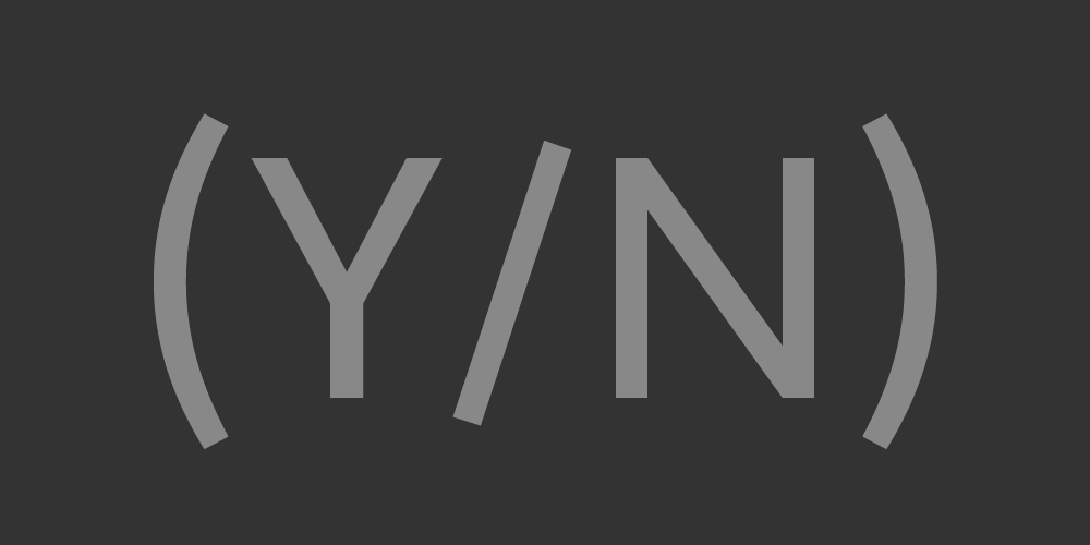
Case-Sensitive
To match all caps or small caps text settings, Seravek has case-sensitive punctuation to help keep things like brackets and apostrophes in line.
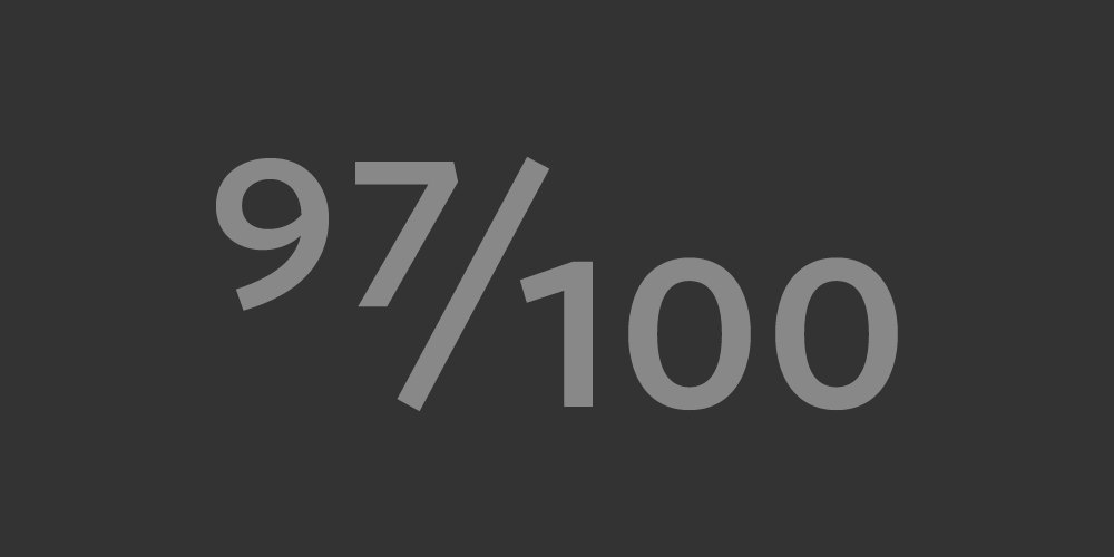
Fractions
Seravek has pre-built fractions — quarters, thirds, and eighths — as well as numerators and denominators for composing arbitrary fractions.
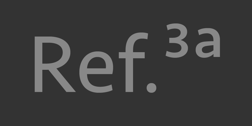
Superscripts
A large set of superscripts & superiors — numbers, letters, and punctuation — allow for typesetting various data, footnotes, mathematical material, and more.
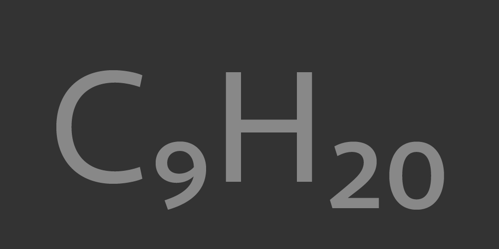
Subscripts
A large set of subscripts & inferiors – numbers, letters, and punctuation — allow for typesetting various data, chemical formulas, and mathematical material.
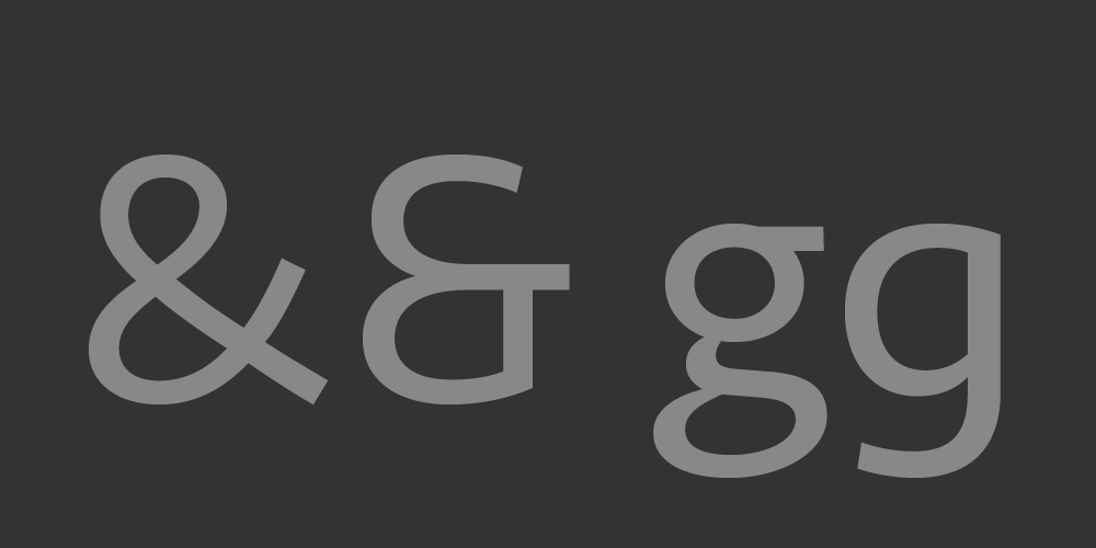
Alternates
Via OpenType Stylistic Alternates, you can change the default ampersand and lowercase g.
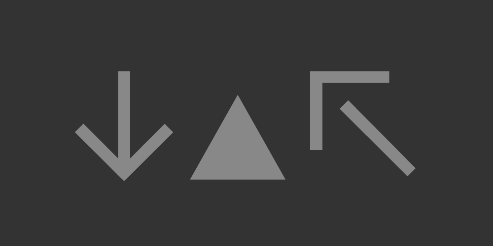
Ornaments
Seravek contains a several kinds of arrows and shapes, found as OpenType Ornaments (Roman only).
Details
Formats
Desktop: OTF (OpenType). Webfonts: WOFF & WOFF2 (Web Open Font Format) and EOT (Embedded OpenType).
Languages
Seravek includes our Extended Latin character set. View the complete list of languages this covers.
Italics
True italic styles match each weight in the family. Their design, though distinct, is not overly expressive.
Basic vs. Pro
We offer a Basic version of Seravek with a smaller character set and lower cost. The webfonts are only offered as Basic.
Try It or Rent It
You can try Seravek at Fontstand, a Mac application that allows for free one-hour trials and monthly rents.